Issue No. 25
Friction causes signup drop off
Asking too much can be determinetal to conversion.
Reading Time: 4 min

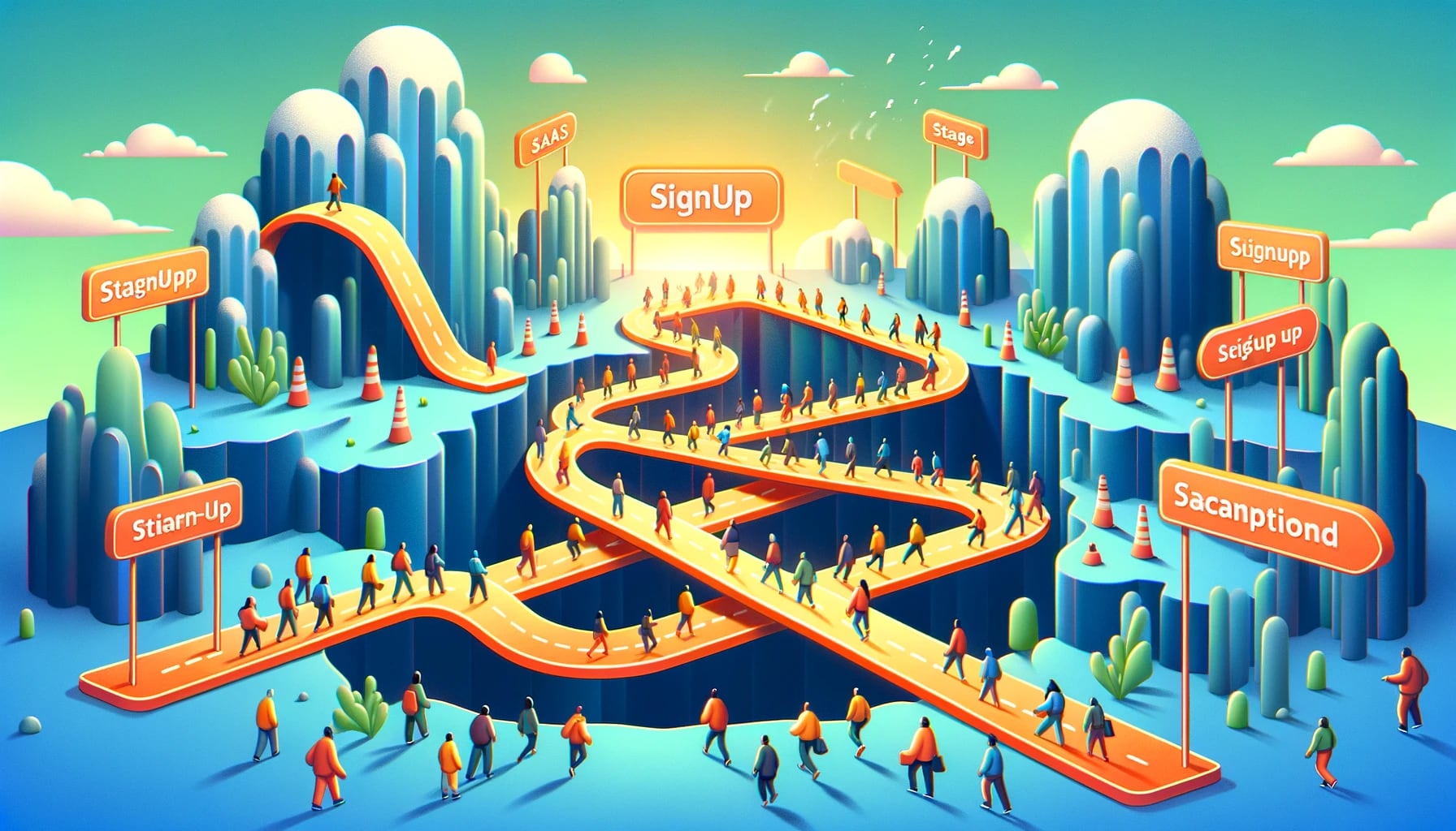
Source: DALLE, told to extract key phrases from this newsletter, create a prompt and using the style illustrative, colorful, futuristic create an image.
This week's main topic is "the impact of too many steps to app signup."
What you'll read this week
- Friction causes signup to drop off (more than you probably realize)
- Weekly Bootstrapping Update
Enjoy!
This week's insight 👉 Lengthy ____ are bad

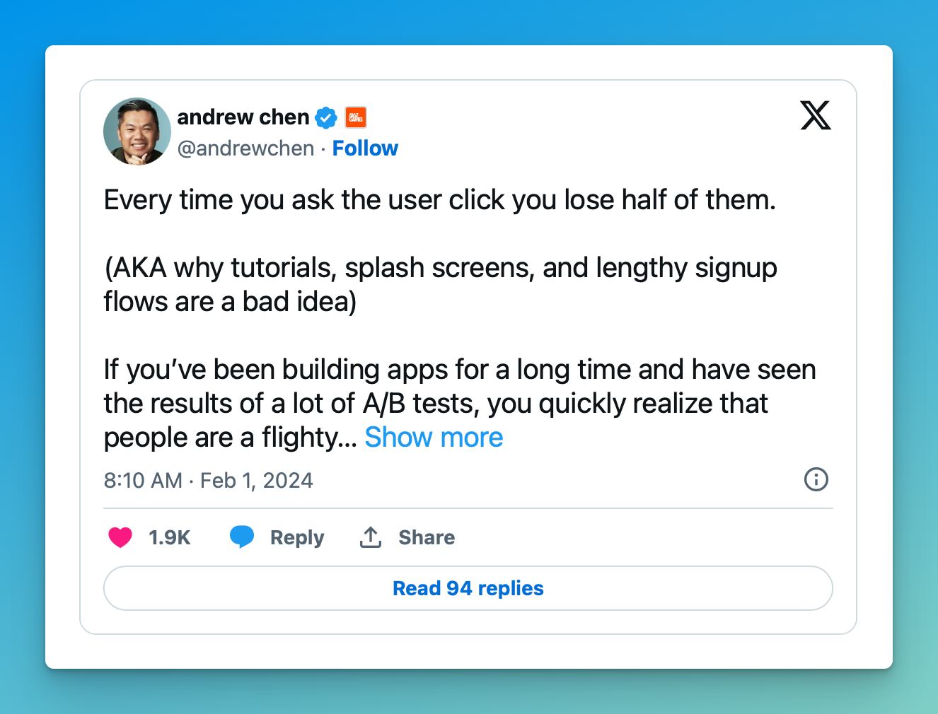
I saw this fantastic tweet by Andrew Chen last week. It came at the perfect time for me. I was beginning to doubt the signup flow for AskJack (more on that below). The whole tweet is a must-read. Andrew has fantastic experience from which he draws these insights.
What is the critical insight for you? Friction nukes engagement. While there are points where friction is necessary, use it sparingly.
Friction causes signup drop-off
I changed my mind last week.
I've been working on AskJack's user signup flow. A couple of weeks ago, I decided to add friction to it.
My thinking was I wanted to:
- Make sure they get to the "Aha!" moment
- Validate desire
To do this, I decided the signup flow should include the following:
- Setting up a data source — My thinking was, let's focus on the most accessible connector (it still took three clicks) and show off our other ones, too. By adding a data source early, we force the step required to get to Aha!
- Pick a subscription and add your credit card — I'd reduce tire kickers and validate that someone really wants this by entering a credit card upfront.
🤦🏻♂️
Asking the users to do all this upfront is a bad idea.
So this weekend, I had an aha moment after seeing Andrew's tweet, talking to one of our design partners, and hearing back from the UX audit we hired (more in my update below).
Our signup flow was going to be a huge problem.
Today, we need users to give feedback. And the design flow we were about to launch with would cause a lot of drop-off.
Not at all what we need. In fact, it is counter to what we need.
The impact of friction on signup, 50% lost at each step
Here are the steps in the signup flow we were going to launch with:
- Email & password
- Ask for their name and company name (so we can personalize things)
- Show them the data connectors we support and have them pick one or more to setup
- Show them our pricing plans and require them to select one
- Enter credit card info
- See a page on what to do next
Yikes, six steps!
Using Andrew's thinking, if 100 people click signup, we'd see:
- 50% drop off at email and password, leaving only 50.
- 50% drop off at their name and company name, leaving only 25.
- 50% drop off at seeing data connectors leaving 12. But there is probably more drop-off here since it's an open-ended step that may require IT's assistance.
- 50% drop off on selecting a plan, leaving 6.
- 50% drop off on entering a credit card, leaving 3.
THREE! Three people out of 100 would get to a page telling them to set up the Slack app.
🤢 Yikes, this was a horrible idea and probably would be fatal for our launch.
Ask yourself, what's my goal, and do we need to ask that?
Once I realized the train wreck I had set us towards, I corrected course and now have a new principle for all flows.
Always ask what the goal is today for this flow.
Don't solve future problems, which is precisely what I was doing.
Our #1 goal today is to get signups so we can engage with them for feedback.
If that's the case, the signup flow must be shorter.
So the next question I asked for each step was, do we need to require the user to do this? Can we figure it out ourselves? If not, can we ask later? Does it even matter?
This left us with a much shorter signup flow:
- Email & password (50% → 50)
- Website URL or upload a policy document (50% → 25)
- DONE! You're on our dashboard.
25 people should get to our dashboard instead of 3.
An 840% improvement. Wow.
This UX refactor left us with a better starting point.
Why ask for a policy document to upload? We can use AI to analyze it, have them land on our dashboard, and prompt them with questions the document can answer. Showing them how it'll work for their users in Slack.
Now, they don't have to use their imagination to figure out what to ask (a massive problem for chat-prompted AI).
So we should have them to the "Aha!" moment faster, and we skip the need for IT's assistance, letting them test it themselves without needing imagination. 🤯
Lesson learned - always question if you need to ask that. It often can lead to insights.
When to use friction
So when should you add friction?
When you need to.
Sorry, that's not a helpful answer.
What I mean is add friction when friction can drive the behavior you need.
For example:
- Is validating need important because you're seeing a drop-off too soon? Then maybe adding a credit card is a good experiment for a while.
- Is a key step to get to aha needed? Then, like we're doing, ask for it. But make it dead simple. We won't even show them things that could lead to someone else needing help.
Just be sure you have a legitimate reason and understand that the trade-off is completion drop-off.
Weekly Bootstrapping Update
Email subscribers get a behind the scenes updates on the two SaaS my co-founder and I are creating.
Join the ProductFoundry Newsletter
Signup for insights into making great SaaS products and companies.